Data Visualization Tool Guide: Explore Charts, Dashboards, and Insights
Data visualization tools are software platforms designed to convert complex datasets into visual formats such as charts, dashboards, graphs, and maps. These tools exist because raw data, particularly large datasets, can be difficult to interpret without visual representation. By transforming numerical information into visual patterns, data visualization tools make it easier for people to understand trends, relationships, and anomalies.
In many organizations, data is collected continuously through operational systems, digital platforms, and analytical databases. Without structured visualization, interpreting these datasets would require advanced technical analysis. Data visualization tools bridge this gap by presenting insights in intuitive visual formats that can be understood by analysts, managers, and decision-makers.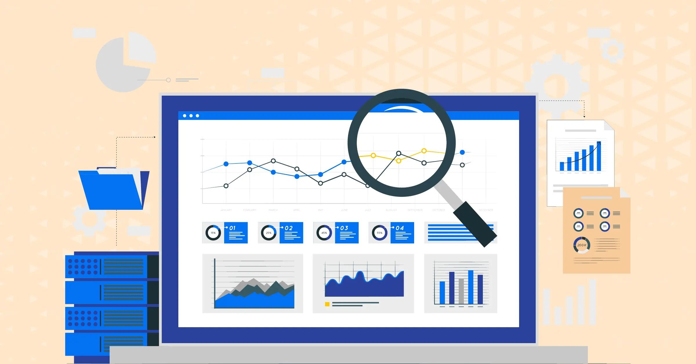
The concept of data visualization tools has become increasingly relevant as businesses, governments, and research institutions rely on data-driven insights to guide planning and strategy. Visualization techniques allow stakeholders to observe patterns quickly, compare multiple variables, and communicate findings effectively across teams.
Importance
Data visualization tools play an important role in helping organizations interpret and communicate information derived from large datasets. They affect analysts, researchers, business managers, policymakers, and technical professionals who depend on clear insights to guide decisions.
Key reasons data visualization tools matter include:
-
Improved data understanding: Visual charts and dashboards help interpret complex datasets quickly.
-
Faster decision-making: Decision-makers can identify trends and patterns without reviewing raw spreadsheets.
-
Enhanced communication: Visualization allows analytical insights to be shared across departments in a clear format.
-
Pattern identification: Graphical representations highlight correlations, anomalies, and performance indicators.
-
Operational monitoring: Dashboards provide continuous visibility into performance metrics and operational data.
For sectors such as finance, healthcare, logistics, education, and public policy, data visualization software enables a more accessible understanding of analytical findings.
Common Visualization Formats Used in Data Analysis
Data visualization tools support a variety of chart formats, each designed for a specific analytical purpose.
| Visualization Type | Purpose | Typical Insight |
|---|---|---|
| Bar charts | Compare values across categories | Product performance comparison |
| Line charts | Show trends over time | Revenue or usage growth |
| Pie charts | Represent proportional distribution | Market share visualization |
| Scatter plots | Identify relationships between variables | Correlation analysis |
| Dashboards | Combine multiple visualizations | Real-time operational insights |
These formats allow analysts to transform raw data into data visualization insights that can be easily interpreted.
Recent Updates
Recent developments in data visualization tools reflect the growing demand for interactive analytics and real-time insights.
Notable developments observed in 2025 and 2026 include:
-
AI-assisted visualization: Analytical platforms increasingly include automated chart suggestions based on data patterns.
-
Interactive dashboards: Advanced dashboards allow users to filter, drill down, and explore datasets dynamically.
-
Integration with cloud data systems: Data visualization software now connects directly to large-scale data warehouses and cloud analytics platforms.
-
Real-time data streaming: Visualization tools increasingly support live data feeds for operational monitoring.
-
Collaborative analytics environments: Teams can view and interpret dashboards simultaneously within shared workspaces.
These improvements enhance the ability of data visualization tools to deliver timely and meaningful insights across industries.
Laws or Policies
The use of data visualization tools may be influenced by regulatory frameworks related to data governance, privacy protection, and information transparency.
Common policy considerations include:
-
Data protection regulations: Rules governing the handling of personal or sensitive data used in visual reports.
-
Information transparency policies: Requirements for accurate reporting and disclosure in regulated industries.
-
Public data governance frameworks: Guidelines for presenting government or research data responsibly.
-
Industry compliance standards: Certain sectors require specific reporting formats for analytical dashboards.
These policies ensure that data visualization software is used responsibly and that insights derived from data remain accurate and compliant with regulatory expectations.
Tools and Resources
Several platforms and resources support data visualization and analytics workflows. These tools allow analysts and organizations to convert raw data into meaningful visual representations.
Commonly used resources include:
-
Data visualization platforms used to create dashboards and analytical charts.
-
Statistical analysis environments that support visual data exploration.
-
Spreadsheet visualization features that generate graphs from structured datasets.
-
Open data repositories providing publicly available datasets for analysis.
-
Data modeling frameworks used to prepare datasets before visualization.
These tools enable users to transform raw information into data visualization insights that can guide analytical interpretation.
Data Visualization Workflow
Understanding the workflow behind visualization helps explain how analytical insights are produced.
| Workflow Stage | Purpose | Key Activity |
|---|---|---|
| Data collection | Gather relevant datasets | Import structured data |
| Data preparation | Clean and organize data | Remove inconsistencies |
| Visualization design | Choose chart types | Create visual representations |
| Insight interpretation | Analyze patterns | Identify trends or anomalies |
| Communication | Share insights | Present dashboards and reports |
This structured workflow helps organizations transform analytical results into understandable visual narratives.
FAQs
What are data visualization tools used for?
Data visualization tools are used to convert complex datasets into charts, dashboards, and visual insights that make information easier to interpret.
Why are dashboards important in data visualization?
Dashboards combine multiple visualizations in a single interface, allowing users to monitor performance indicators and trends.
Who typically uses data visualization software?
Analysts, researchers, business managers, and policymakers commonly use data visualization tools to interpret analytical results.
Can data visualization reveal patterns in large datasets?
Yes. Visualization techniques highlight correlations, trends, and anomalies that might not be obvious in raw data tables.
How do charts improve data communication?
Charts present information visually, making complex analytical findings easier to understand and explain.
Conclusion
Data visualization tools play a central role in modern analytics by transforming complex datasets into clear and interpretable visual formats. Through charts, dashboards, and graphical analysis, these tools help organizations identify trends, communicate insights, and support data-driven decisions. As digital data continues to expand, visualization technologies remain essential for translating analytical information into meaningful insights that guide understanding across industries.

You may also like...

Understand Print Advertising: Resources and Knowledge for Modern Marketers
Last Update: March 25, 2026
Read
Real-Time Supervision Service Explained: Overview, Basics, and Key Information
Last Update: April 01, 2026
Read
Data Visualization Tool Guide: Explore Charts, Dashboards, and Insights
Last Update: March 23, 2026
Read